entry 005
2 sep 2026
kris vandenberk
5 min
Nobody becomes a VC to do KYC/AML. So we fixed that.
An unusually enthusiastic article about paperwork.

Last time, I wrote about how we automated our LP reporting. I also said KYC/AML was next. “More on this soon,” I wrote, using soon in the way VCs tend to use it when talking about anything without a term sheet deadline.
Turns out, soon is now.
Compliance is no joke
If LP reporting was leg day, KYC/AML is probably the stretching afterwards. Nobody particularly enjoys it, nobody talks about it at demo day, but ignoring it isn’t really an option.
And yet, I suspect quite a few funds still handle parts of it in ways they would find slightly embarrassing if one of their portfolio companies did the same.
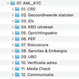
Ruth and I run a regulated fund. This comes with all the things you’d expect: identifying UBOs, PEP and sanctions screening, adverse media checks, CRS/FATCA, collecting documentation, periodic reviews and, most importantly, being able to demonstrate afterwards what you actually did.
None of this seems particularly difficult in isolation (not everyone will agree). However it takes a lot of time and the challenge is doing it consistently.
Our old process was a fairly familiar combination of email, Excel and PDFs. Ask someone for a copy of their ID. Save it. Update the spreadsheet. Check whether something is missing. Run the relevant checks. Set a reminder somewhere for documents that expire. Repeat.
Ruth who is our fund’s Anti-Money Laundering Compliance Officer (AMLco) did the hard work and made the actual compliance calls, I just had to review and acknowledge (4-eyes principle). It worked. But it was exactly the kind of process that we keep telling founders they should automate.
FundOps, an AMLco’s wet dream
So FundOps - which started life internally as “the Quarterly LP reporting thing” - has gradually become something much bigger.
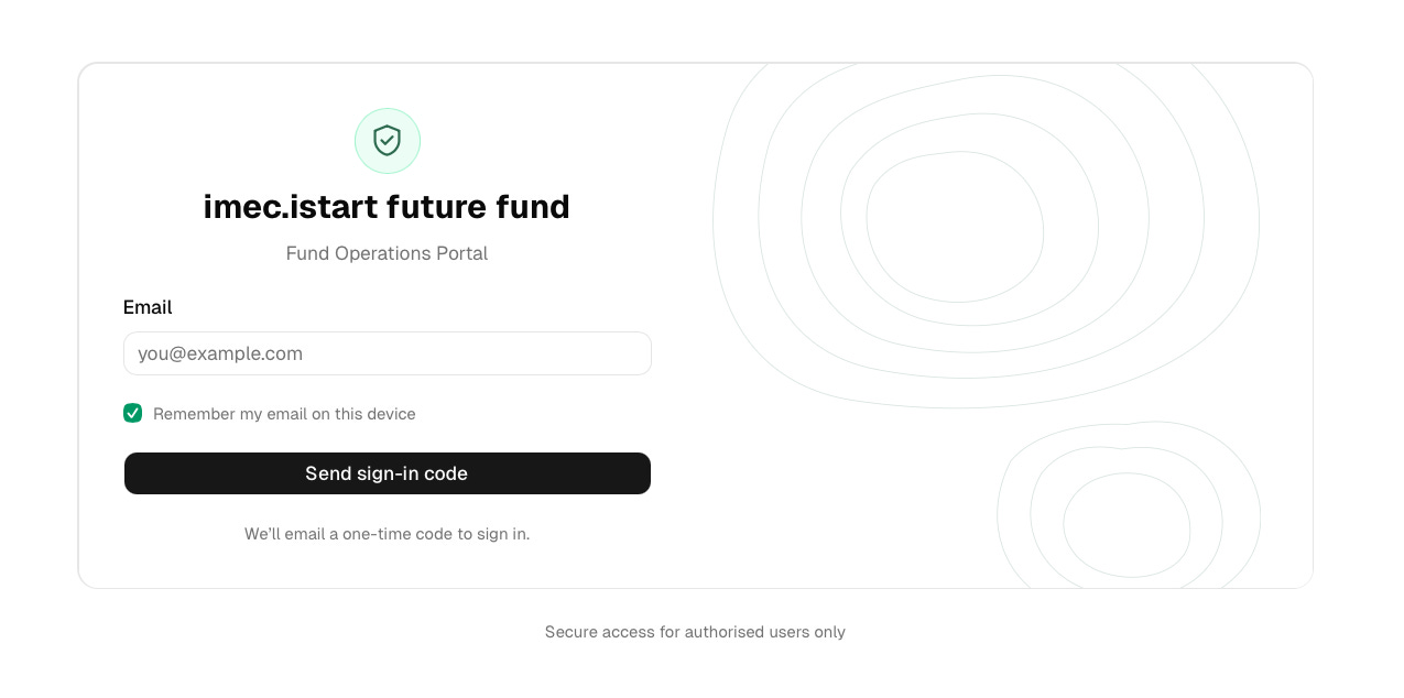
Customer onboarding now happens through the same portal we use for reporting. An LP receives a magic link and uploads the documents we need there. No additional account or password.
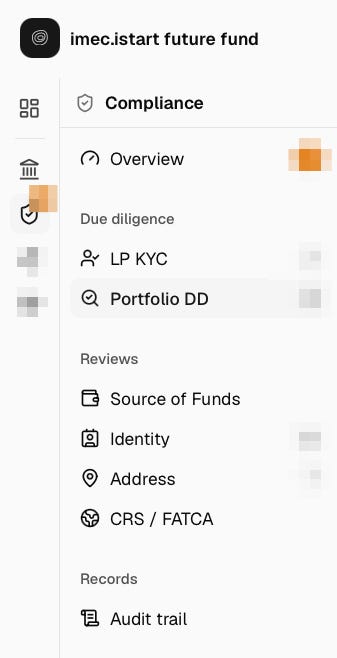
The system extracts the relevant information from those documents and keeps track of things such as expiry dates. Screening is integrated into the workflow as well: sanctions, PEP and adverse media checks are launched during onboarding and again when we rescreen. CRS/FATCA is part of the same process instead of living in a separate PDF/email/spreadsheet universe
It also turned out there was no particularly good reason to limit this to LPs. We now use the same compliance stack as part of our portfolio onboarding due diligence: screening the company, founders, UBOs and directors, as well as VC funds and business angels. Same checks, same workflow, same audit trail. Different side of the cap table.
Across both LP onboarding and portfolio onboarding, we now have an even better record of what happened.
That last part matters.
AI can extract a passport. It can match names against lists. It can flag something that deserves a closer look. However it doesn’t magically make the compliance judgment but provides us with analysis, insights and recommendations. Ruth is our AMLco, and the actual decision still sits with her.
The second red pill
Building the LP reporting system taught me that AI dramatically reduces the distance between thinking someone should build this and actually building it yourself.
KYC taught me something slightly different.
The interesting use cases aren’t necessarily the shiny ones.
There are hundreds of processes inside a company that nobody would ever have bothered building software for. The problem wasn’t important enough to hire engineers for. Buying another SaaS product felt excessive (our case). So the process survived in the natural habitat of neglected business operations: Excel, email and inside somebody’s head.
AI changes the economics of fixing those processes.
KYC is a good example. I didn’t wake up one morning with a burning ambition to build compliance software. I just got increasingly annoyed that information we already had was being copied between systems, that checks had to be initiated manually and that we were maintaining spreadsheets to remember when other spreadsheets needed updating.

Once building software becomes cheap enough, those annoyances become worth fixing.
And the result isn’t just saving some time.
A few LPs have already gone through the new document flow. And what I like most is that it feels like part of the fund rather than an administrative process bolted onto it after the fact.
For a small fund, that matters. We’re never going to win by having a bigger operations team. But there’s no reason we can’t have the same or even better infrastructure.
And yes, we expect the same from our founders
We now use software we largely built ourselves to screen founders, before investing in them and subsequently telling them to automate more of their own operations. At least we’re consistent.
Quite a few of the companies we invest in will eventually encounter their own version of this. Maybe it’s export-control documentation, quality management, security reviews, customer onboarding or some wonderfully obscure industry-specific process involving PDFs and a government portal last updated in 2009.
Historically, there were basically two options: hire people to deal with it and/or buy software.
There is increasingly a third: build the narrow piece of infrastructure you actually need. That doesn’t mean every startup should start building its own operations stack.
But the threshold for build versus buy has moved dramatically.
We didn’t build FundOps because we want to become a compliance software company. We built it because it was becoming increasingly difficult to tell founders to automate repetitive processes while we were still doing ours manually.
The Excel psychopath in me has apparently metastasised into a compliance-automation psychopath.
Ruth finds this mildly concerning …